The following visualization was implemented in D3. The data were cleaned and summarized with python and afterwards imputed in the pie chart.
This link shows an interactive pie chart where it calculates the percentage of victims across the globe in 5 year intervals. When cursor is hovering in the segments there are a 3 types of information one can find about the specific slice. Also with the interactive legend, one can unclick an interval and the pie will be recalculated without taking into account the specific interval. As we can see there is an increasing trend of victims after 2005.
The following multi-level donut chart shows the deaths due to firearms, while the second focuses in deaths due to chemicals and the third due to explosives. All of that with respect to the 5-year intervals.
Based on this visual we can infere that the largest proportion of deaths are due to firearms and especially explosives. One can notice that the more pale colours implies larger number of deaths except the chemicals which is the opposite so there is a clear distinction between the 3 levels.
A very easy way to visualize which entities were most often the target of a terrorist attack is via a wordcloud. The standard way of generating word clouds is using the python module wordcloud.
After cleaning the data to make it useful, a short python script gives the following output.
As one can see, regular citizens are most frequently the target of attacks. On the second place, all kinds of private instances are found. Afterwards, police officers and government officials are targeted.
The reason we chose for this visualization is for its simplicity, yet giving a lot of information in a glance.
The following visualization was made completely in D3.
On this page, one can find an interactive globe. It is possible to change the year using the slider, as well cycle through the whole data set using the time travel button below.
Since smaller countries, such as Belgium, were quite hard to hover over, zoom funcionality was added. Also a colorbar was added, making the visualisation more interpretable. The scale of the colorbar correctly adapts when the chosen year changes.
The following visualization was first drafted in Tableau and later finalized in D3. This link shows a dot for each year for 12 region that depends in size on the sum of the number of attacks and each dot is colored by the number of individuals killed. The bigger the dot, the more attacks happened. The redder the dot, the more number of individuals that got killed. In the updated version an interactive tooltip is added that shows for each dot the exact number of attacks and the number of individuals killed. The visualization clearly shows that between 2005 and 2010 in the Middle East and North Afrika many deadly attacks happened.
The following visualization was first drafted in Tableau and later finalized in D3. This link shows a dot for each month and year that depends in size on the sum of the number of individuals killed. The bigger the dot, the more individuals got killed in that specific month. A maximum trendline is also added in red, this selects for each year the month with the highest number of individuals killed. In the updated version an interactive tooltip is added that shows for each dot the exact number of individuals killed. The visualization shows that between 2012 and 2019 the dots are bigger in size and thus more individuals got killed in this time period. The dot showing month 9 of 2001 is also significantly bigger and shows that 3390 individuals got killed in this month. There is no clear indication that there are months that are more dangerous or safer than other months. However the maximum trendline shows a decreasing trend over the years. In the seventies the average month of each year with the maximum number of killed is around month 9, while in the twenty-tens this is around month 5.
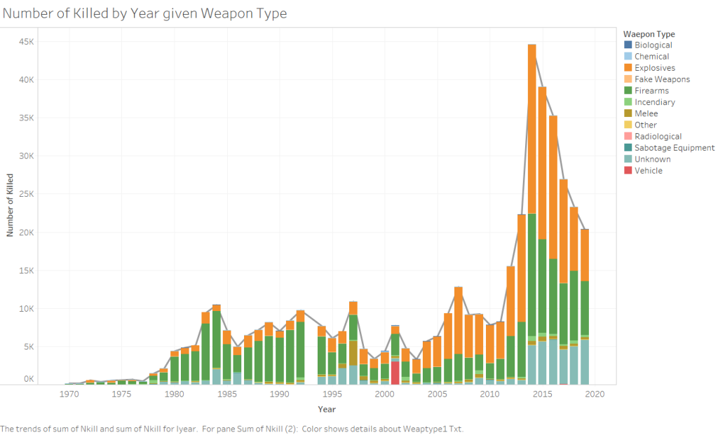
The following visualizations were first drafted in Tableau and later finalized in D3. This link shows a histogram of the total number of attacks for each year, with each bar subdivided by the weapon type used during the attack. In the updated version an interactive tooltip is added that shows for each bar the exact number of attacks. The visualization shows that the most commonly used weapons are explosives and firearms and that most attacks have found place between 2012 and 2019. There is a strong increase in the number of attacks that happened after 2011, during this the weapon type explosives gained popularity. It also has to be noted that after 2011 there is a large increase in the number of attacks reported with an unknow weapon type. A hopeful sign is the systematic decrease of the number of attacks after 2014.
A variation of this visualization is also made for the number of individuals that got killed each year, with each bar subdivided by the weapon type used. Here also an interactive tooltip is added that shows for each bar the exact number of individuals killed. The visualization shows that most individuals got killed between 2012 and 2019. The most dominant weapon type in the seventies, eighties and nineties are firearms. After the nineties firearms are still dominant, but explosives take the leading role. There are two exceptions to this; in 1997 melee is the most dominant weapon type and in 2001 vehicle is the most dominant weapon type. It also has to be noted that after 2011 there is a large increase in the number of attacks reported with an unknow weapon type. A hopeful sign is the systematic decrease of the number of individuals killed after 2014.
This visualization was first drafted in Tableau and later finalize in D3. It is a representation of the world that shows a colored density for the total number of individuals killed in each country between the year 1970 and 2019. The legend in this updated version is more specific and gives better insight to the total number of killings as the countries showed great variation e.g. Belgium a total of 83 deaths and Iraq 81,019. Furthermore, it also gives the opportunity to hover across the countries and shows the country name and the total deaths due to terror attacks. The map shows that the following top 3 countries in total death by terror attacks.
Iraq
Afghanistan
Pakistan
The d3 graph was implemented in a tableau dashboard , for the use of the interactivity of the graph one may visit the tableau dashboard or a quick view in the codepen edition beneath.
The same procedure was taken for the choropleth graph of the total number of attacks between 1970-2019. Again the top 3 countries can be found.
The following visualizations were first drafted in Tableau and later finalized in D3. This link shows a bar chart of the total number of attacks by target type with each bar subdivided by the used weapon type. In the updated version an interactive tooltip is added that shows for each bar the exact number of attacks. The visualization shows that the number of attacks is highest for the target type private citizen and property, followed by military and police. It also shows that the number of attacks is highest for the weapon type explosives, followed by firearms.
These conclusions are validated by rotating the variables of this bar chart, such that the total number of attacks is measured by weapon type with each bar subdivided by target type, see this link.
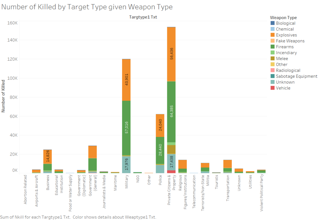
Furthermore this link shows a bar chart of the total number of individuals killed by target type with each bar subdivided by the used weapon type is plotted. In the updated version an interactive tooltip is added that shows for each bar the exact number of individuals killed. The visualization shows that the number of individuals killed is highest for the target type private citizen and property, followed by military and police. It shows that the number of individuals killed is highest for the weapon type firearms, followed by explosives.
These conclusions are validated by rotating the variables of this bar chart, such that the total number of individuals killed is measured by weapon type with each bar subdivided by target type, see this link.
In this blogpost, we share the progress we have made on the implementations of the visualizations we considered.
The interactive globe
For this implementation, the first part was preprocessing the data. For this, we filtered the data in python to only contain the relevant variables, and then added another variable called CountryCode (using pycountry). We found a geoJSON file that gave us the groundworks of making the countries visible in d3, and then proceeded to link these data sets. At the moment, we can hover over countries to get the respective data (for each year), we can pan the earth and we can change years using a slider. The project is not yet finished, since we would like to add some functionality allowing us to zoom in. Since this project is not yet finished, we won’t implement it into the blog. Instead, we show a screenshot of what it currently looks like.
Trends in attacks
This visualization is made with Tableau. It is a histogram of the total number of attacks by each year, each bar is subdivided by the weapon type used during the attack. It shows that most attacks found place between 2013-2016 and that the commonly used weapons are explosives and firearms.
A variation of this visualization is also made for the number of individuals that got killed each year. It shows that most individuals got killed between 2014-2016. There is a switch in the type of weapon used in the nineties; before the nineties firearms are dominant while after the nineties explosives are more dominant.
3. Histogram for target and weapon type
This visualization is made with Tableau. It is a histogram of the total number of individuals killed by target type with each bar subdivided by the used weapon type. It shows that the number of individuals killed is highest for the target type private citizens and property, followed by military and police. In general we can see that explosions are a popular weapon type, followed by firearms. Several variations of this visualizations are made, also for the number of attacks.
Density world map
This visualization is made with Tableau. It is a world map that shows a colored density for the number of individuals killed in each country. The country with the highest number of individuals killed is Iraq, followed by Afghanistan. A variation of this visualization is also made for the number of attacks.
5. Deadliest month for each year
This visualization is made with Tableau. It shows a dot depending in size on the sum of the number of individuals killed for each month and year. A maximum trendline is also added, for each year it selects the month with the highest number of individuals killed. A linear regression line is added for the data point included in this maximum trendline, to show which month is the deadliest over the years.
Deadliest and most attacked year for a region
This visualization is made with Tableau. It shows a dot depending in size on the sum of the number of attacks for each year and 12 regions, each dot is colored by the number of individuals killed.
7. Number of deaths in 5 year intervals
This implementation required cleaning and processing the data so we can have the total amount of deaths, then we seperated in 5 year intervals and made this 10 segment interactive pie in D3. The project is not finished yet as we have to make it as a layer pie chart showing also the 3 main weapons used for these attacks.
The blog of team UBUNTU at first glance is a little cluttered BUT is well structured, guides the reader through each phase of visualizations in a very informative way and has a clear workflow. As a first general remark the visualizations try to answer the research questions and although they are very informative there is a small void regarding the question of the circumstances of the killings.
A great visualization that is definitely very interested and should be used is the flower map in association with all the states in the USA. It might seem a little complex at the beginning but it is also intriguing and very informative once the reader knows the variables. Also the connected-line plots are very pleasant to see as they are containing information about individuals.
Lastly, although this is not in its final form, scatterplot is very informative regarding some social characteristics, it would be better to use a scatterplot and try to explore more complex variables and give an overview about the novel question.
To sum up, it seems that team UBUNTU really put time and effort and tried to depict the basic and meaningful variables on their dataset, they were creative but they should probably work a little bit more on the scatterplot.